Being a huge fan of potatoes in almost all their forms, I wanted to put the various potato derivatives in some comparable format and so I've come up with the first ever Potato Phase Diagram! Here it is (click on the photo to enlarge):
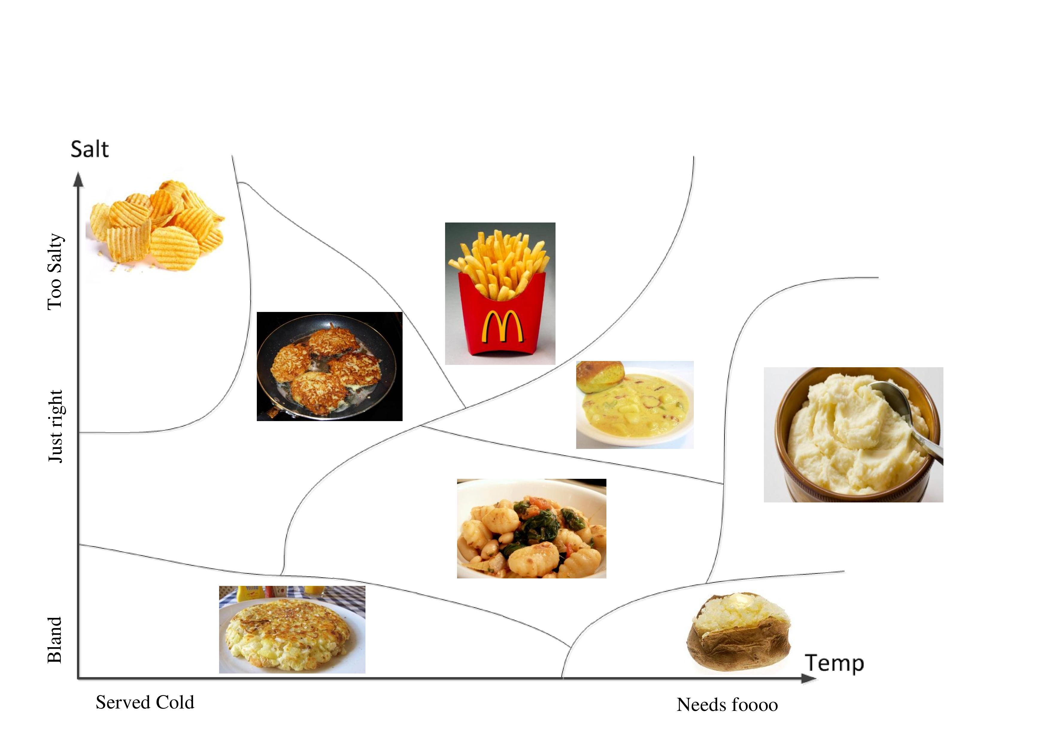
Can you guess the different potato phases from the pictures? Notice that in this coordinate system (American Breakfast Coordinate System – ABCS), Hash-Browns are served cold.
And since phase diagrams are usually three dimensional (P,V,T, being the usual coordinates) I added this as well:

What can I say, not a big gnocchi fan…
Oren

מקסים ואינפורמטיבי. עם זאת, ציפיתי שגרף בשלושה מימדים יציג את מאכלי התפודים כפונקציה של: (1) טמפרטורה; (2) מליחות; (3) טעם
She doesn't like gnocchi?
Has she gone BANANAS?
(and where does the hellishly-hot half-burned tasty-as-nothing-else bonfire potato fit in the graph?
The hellishly-hot half-burned tasty-as-nothing-else bonfire potato can be shown to be a compact subspace of the extremely-hot tasty-if-you-put-enough-salt-and-butter-on-it baked potato which is shown on the phase diagram. So what I'm basically saying it that it is represented in the data set.
great over view for an Israeli, when you leave in country like Holland which mastered in make everything, and I mean EVERYTHING out of potatoes, you get to learn that the variety of dishes is much larger that what you presented :), but then I miss additional dimension in you graph, oiliness.
btw, in the open market we have a guy specializing in potatoes (no it is not a joke) he sells only potatoes, when he gets wild he has some onion too…
anyhow this guy has around 20 different types of potatoes! and every potato type taste has a special unique and different taste (that was a joke)
see you very soon 🙂
קצת באיחור אבל אני מתנדבת לאתגר את עדי ולהכין לכם, בפעם הבאה שתבואו אלינו, ניוקי מוקרמים בתנור, עם רוטב עגבניות ופרמז'נו, ונראה אותה לא אוהבת ניוקי אחרי זה!!